

Neutral
Neutral is the attempt to create a typeface that is free of all connotations or associations that could distract a reader from the text, a font that delivers the character of the written material untouched by the character of the typeface design.
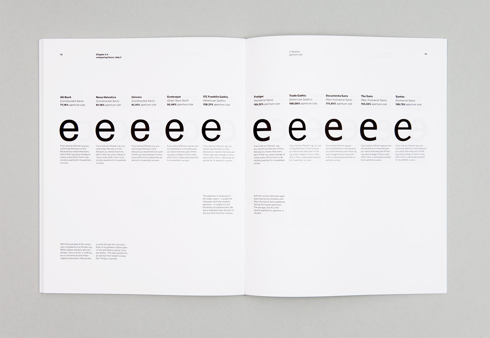
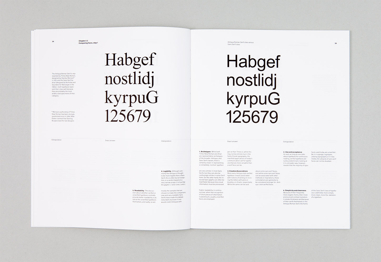
The process drew from ideas such as the Platonic form theory, Conceptual Art, Taoism, and tea ceremonies. Part of the project was to develop a design methodology of comparisons and measurements of typefaces and typeface genres. These measurements would constitute the rules for the design of the typeface.
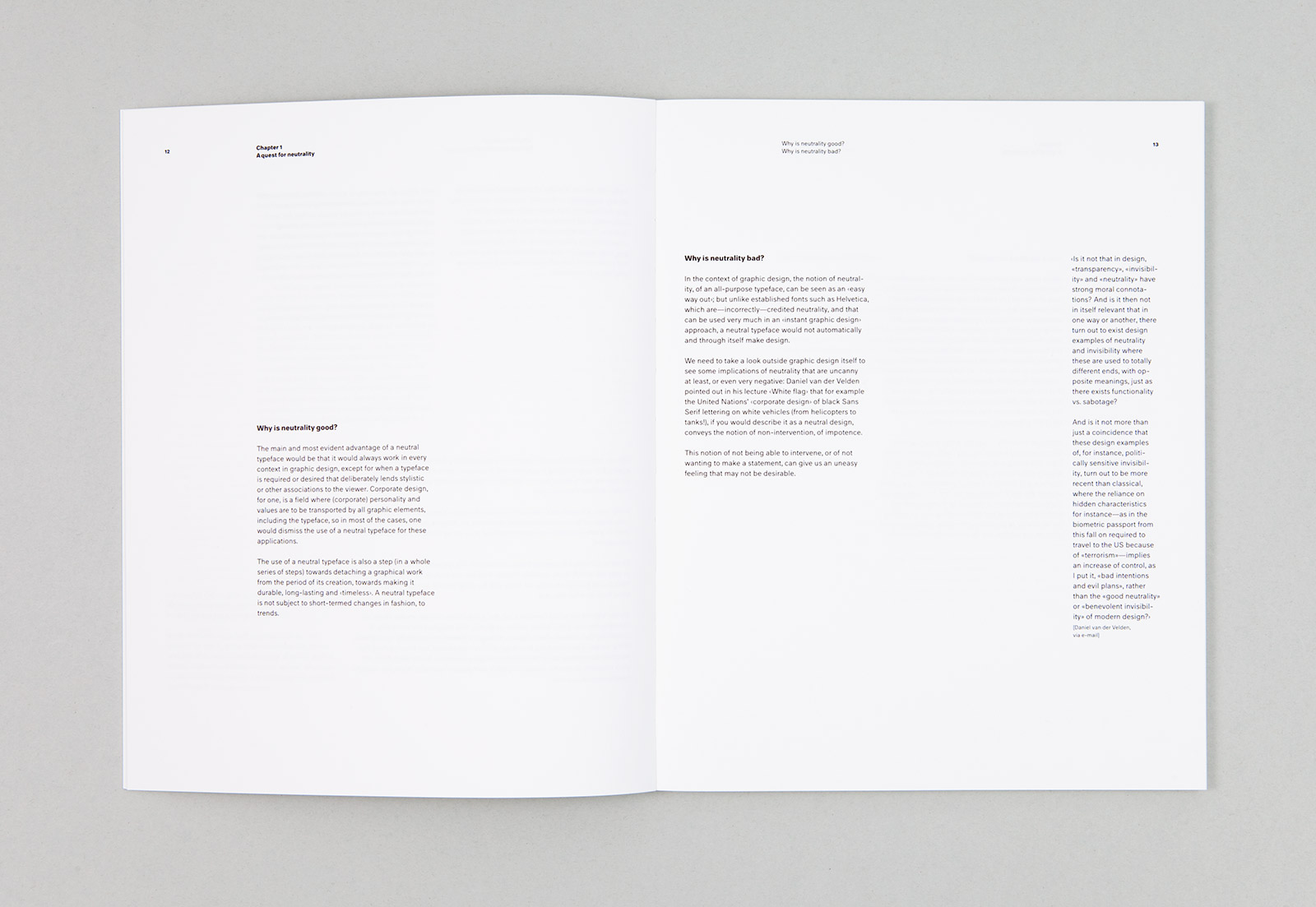
This book chronicles the development and execution of this process, and features excerpts from e-mail conversations with Daniel van der Velden, Experimental Jetset, Uwe Loesch, Bernd Kuchenbeiser and Helmut Schmid.
Through these explorations and exchanges with other designers Kai arrived at this definition of neutrality that could be applied to a typeface:
Neutrality can be regarded as an auxiliary construction that lets us describe things and events that appear free of connotations to a specific social and cultural group at a specific point in time. Because everybody’s backgrounds and expectations differ, however, the more closely we attempt to answer the question ‘What is a neutral typeface?’, the fewer people agree on various details, and the more the proposal of a neutral typeface becomes a paradox.
Self-initiated. Part of Kai’s graduation work (BA) from the Royal Academy of Art, The Hague, 2005.