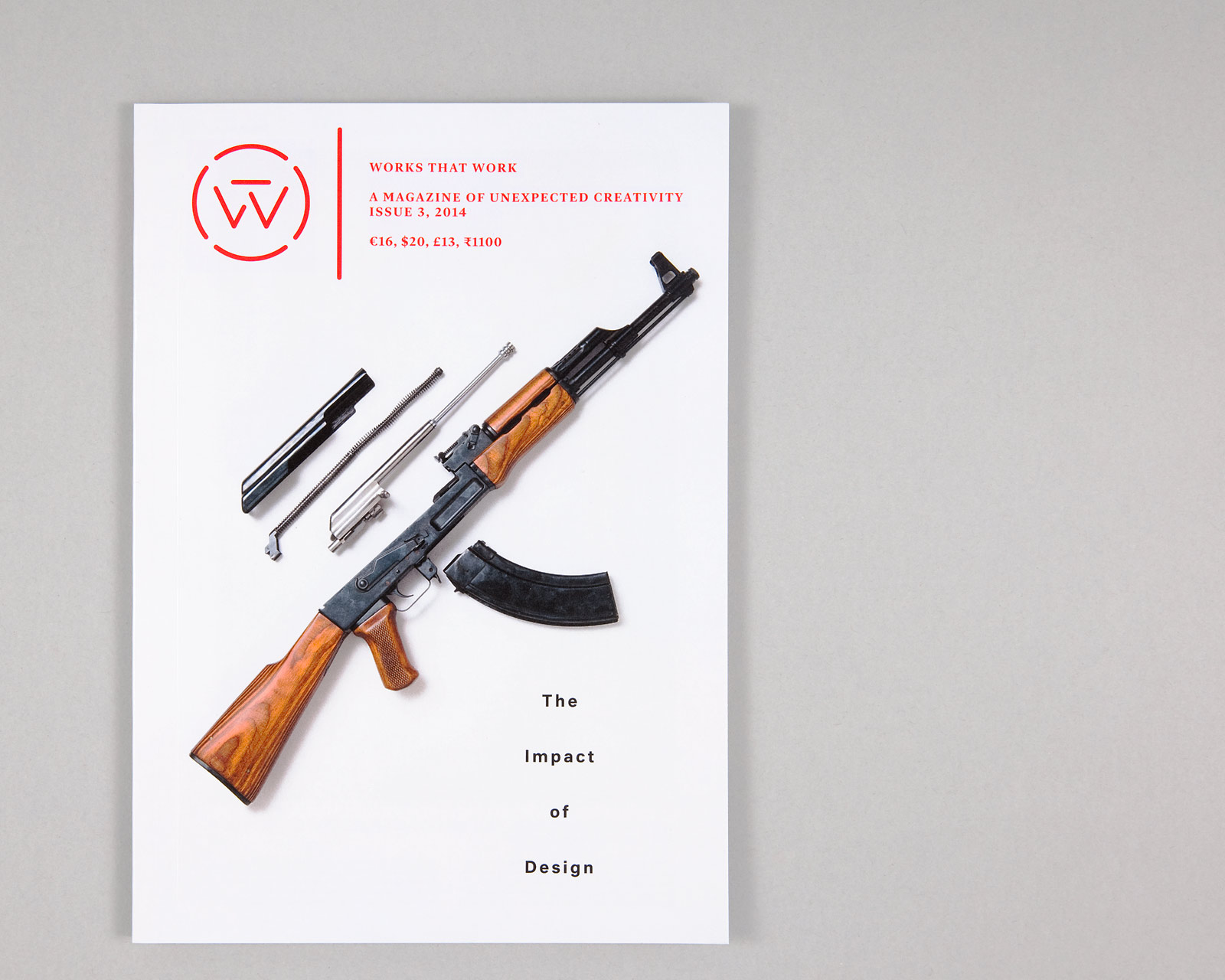
Works That Work Issue 3
It has been a joy to conceive and layout Peter Biľak’s Works that Work magazine for the curious, and it’s gratifying to develop the design, letting it grow with the magazine itself.
We fine-tuned production and use of materials, making the magazine an ever-better container for the stories it tells, and an ever-better reading machine. For issue 3, we also proposed to switch from staples to very nice binding, which by itself had a big effect on how the magazine feels and functions.
We stayed true to the idea of creating a newsy urgency within the magazine, which we played up a bit for this issue – some of the articles deal with quite terrible long-term effects of design. But at the same time, we are also allowing for more airy, lyrical layouts where the content allows it.
Oh, and we added Neutral as a secondary typeface, for a bit more variety in the typographic palette.
For Peter Biľak, The Hague, 2014, ongoing.
17×24 cm.
Related
- Read more about our concept for the magazine at Issues 1/2
- Nominated for Design Museum London’s Designs of the Year 2013
- Order/subscribe to Works That Work