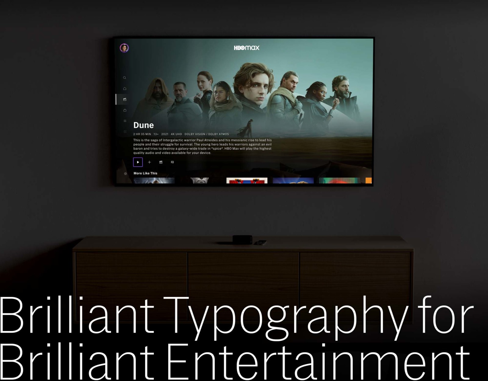
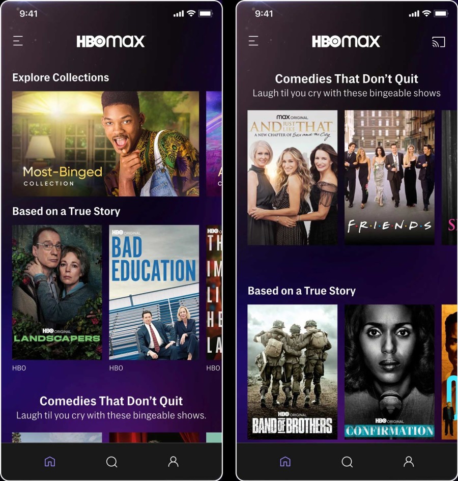
Premium streaming and broadcast service HBO is available on a variety of devices with an array of typographic requirements. From the large but low-resolution TV screen across the room, to the crystal-clear but narrow phone in your hand.
Together with LettError, we developed Street, a custom family of screen-first, graded typefaces. At home on a wide range of screens and platforms, from the living room to mobile, Street provides high quality typographic versatility and brand coherence for a myriad of display technologies.

Back in 2015, HBO recognised that the typeface system they were using was no longer suited for the new and ever more complex tasks ahead, they asked us to help them understand and solve the challenges of highest quality typography across a diverging device landscape.
Overseen by Director of Digital Products Ryan Wilkerson, and in close collaboration with HBO’s digital designers James Catel and Rob McMurray, we focused on brand expression and consistency. Especially the typographic and technical challenges that come with all the different platforms on which HBO has a presence.
In 2021, we were asked to extend the typeface with Cyrillic and Greek scripts under the direction of HBO Max’s Dave Curry and his amazing team. The script extensions were drawn by Ilya Ruderman and Irene Vlachou, respectively.

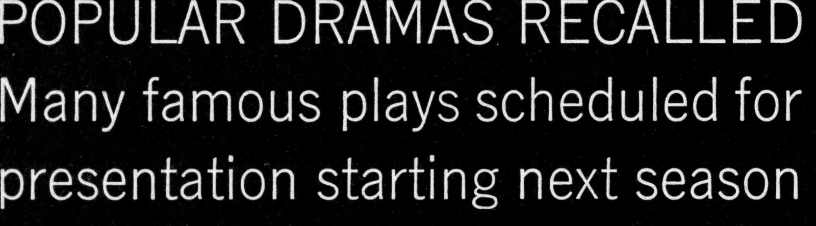
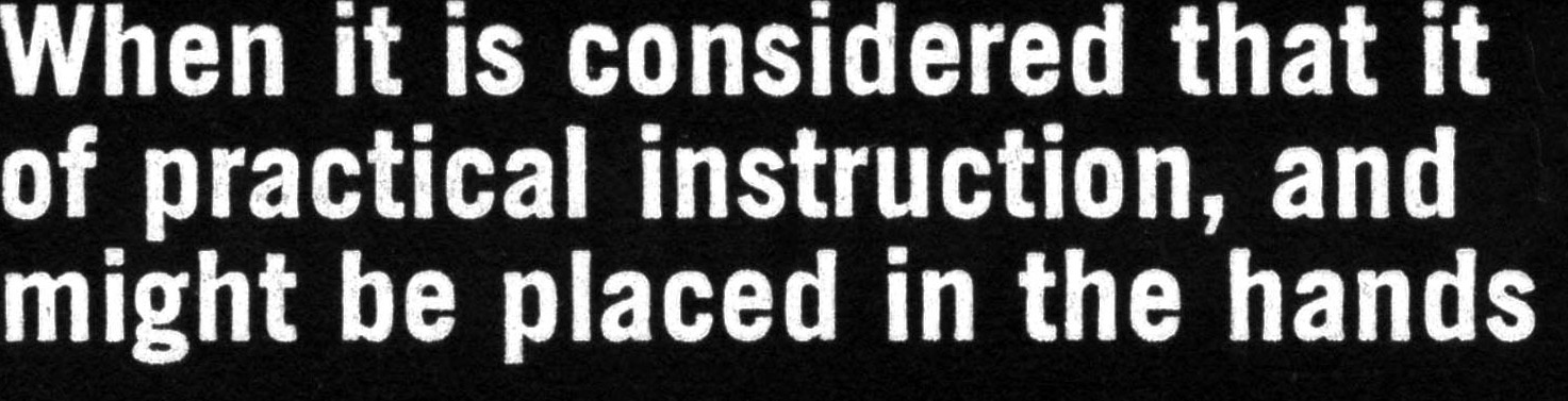
Part of the utility of Street lies in its compact proportions: a large x-height that makes text readable at small sizes and makes for impactful titles. Short ascenders and descenders make tightly stacked lines of text feel airier.
The compactness is balanced with subtle flat sides that save space without appearing tight, because they open up space between the letters. The flat sides and compact proportions allow good readability despite small sizes on handheld screens.
The integrity of the design is better preserved than a more circular approach in low pixel-count scenarios, because they can better be represented in straight lines.
The same approach led us to replace many of the smallest, slightest curves in the typefaces, such as the terminals or stroke-ends in f, j, r or t, by straight lines that are forgiving of low resolution and look super-crisp.
Street adds European precision and sophistication to the popular American Gothic genre of typefaces. The typeface expresses HBO’s brand values: an accessible but premium experience, while the genre’s ubiquity (throughout the history of American design) makes sure that it is “invisible” enough to never compete with HBO’s premium content.
The design takes many cues from the great American classics designed Morris Fuller-Benton, particularly his Lightline Gothic, Monotone Gothic and of course Franklin Gothic, as well as the flat-sided shapes of Jackson Burke’s Trade Gothic.

That said, Street is not a revival. Rather than adapt a visual language optimised for print technology, Street has been designed and tested on screen from the very first sketch to the final proof. And rather than deciding on a genre of typeface up-front and making it suited to our task, very real and complex requirements both functional and aesthetic, gradually steered us in this direction.

HBO is at home on many different platforms, with different screens and resolutions, rasterizers, viewing distances. We took great care to make sure the user experience is consistent and reliable on every platform. The typography in the titles, menus, bios also need to appear as intended: regardless of rendering technology or resolution. With normal typefaces, text that looks great on one platform can render too heavy or too thin on another.
Street offers grades to balance the rendered weight on different screens: For each weight, Street has a lighter and a darker variant. A heavier grade can be deployed for environments that render text more skinny (such as Microsoft and Chromium-based platforms), and a lighter grade is used for those platforms where text is rendered heavier (hello, AppleTV!)
Within each weight, the grades have identical metrics and kerning: there will be no text reflow when switching.
HBO Street comes in 4 weights × 3 grades (or as a variable font with weight and grade axes), including italics, small caps, special number font, extended Latin, Greek and Cyrillic character sets, arrows, lining and small cap numerals (each in lining and tabular variants), you name it.
HBO Street dream team:
- Creative direction, technical concept, type design: Carvalho Bernau (Susana and Kai) and Letterror (Erik van Blokland)
- Commissioner, art direction: HBO digital products (Ryan Wilkerson, James Catel, Rob McMurray, 2016), HBO Max (Dave Curry, 2021)
- Greek type design: Irene Vlachou
- Cyrillic type design: Ilya Ruderman
- Hinting: Mike Duggan
- Mastering: Andreas “Eigi” Eigendorf, Alphabet Type
All titles of shows and movies, character names, and HBO’s branding, logos, or other trademarks, including the Street typeface, are property of Home Box Office, Inc. Please don’t sue us, we’re friends!